Creating and Using Controls

Overview
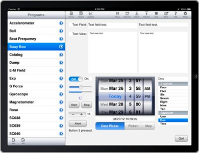
This article uses a kind of program called a busy box to show how to create and use controls in a techBASIC program. The point here is not to create a program that does something useful with each control. No program I have ever seen uses all of these controls for something useful. Instead, the idea is to show each control and how to read its value in a simple, straightforward way you can refer back to when you need one of these controls in one of your own programs.
The program itself is laid out for the iPad when it is horizontal, in the normal programming position. What about an iPad held vertically, or an iPhone? As it turns out, the program still looks and works fine on an iPad in either orientation, but there are just too many controls to show on an iPhone at one time. There are two strategies for dealing with this. One is to create a program with a way to switch between several screens, each with different controls. The other is to create several small programs. For our purpose, the best way is to create several small programs, although the article will describe how to create a program that shifts to show other controls once some basic ideas are introduced.
The article assumes you will type in the program as you read, but the complete program is shown at the end of the article, and is also available for download. If don’t have a desktop computer handy, copy the program from the article and paste it into a blank techBASIC program; if you have a computer handy, you have the option of downloading the complete program and moving it to techBASIC using iTunes. If you are not already familiar with the process of moving a program using iTunes, the techBASIC Quick Start guide will show you how.
Learn How to Use Controls in Your techBASIC iPhone and iPad Programs
Wednesday, April 11, 2012
Buttons
All of the programs we develop here will be event driven programs. Event driven programs don’t stop when the end of the program is reached; they just keep on running. As the user interacts with the program, various subroutines, called event handlers, are called to handle the interactions. This program will be an event driven program, so our first step is to find a way to make the program stop without the ugly necessity of pressing the Stop button on the Run bar. We’ll do that with a Quit button. When the user presses the Quit button, the program will stop.
Create a new program by pressing the New button and name it Busy Box. Start with this code:
! Create a quit button.
DIM quit AS Button
quit = Graphics.newButton(Graphics.width - 20 - 72, Graphics.height - 37 - 20)
quit.setTitle("Quit")
! Paint the background gray.
Graphics.setColor(0.95, 0.95, 0.95)
Graphics.fillRect(0, 0, Graphics.width, Graphics.height)
! Show the graphics screen.
System.showGraphics
END
SUB touchUpInside (ctrl AS Button, time AS DOUBLE)
IF ctrl = quit THEN
STOP
END IF
END SUB
TIP: Rather than typing the SUB line, go to Help, Events, touchUpInside and copy the model line, then paste it into the program.
The first four lines create the Quit button. If you are following along in the reference manual or help system, you will see that newButton takes four parameters, but the last two are optional. The four parameters are the horizontal position of the control, the vertical position of the control, and the width and height of the control. All controls have a width and height default that is consistent with Apple’s human interface guidelines, so you don’t have to specify them if you don’t want to. Looking at the documentation, you can see that the default width and height for a button is 72 by 37 pixels. In general, controls should be no closer than 20 pixels from the side of the page. We use these ideas to calculate an appropriate spot at the lower right edge of the page.
Many of our controls will have white backgrounds, and will fade into the default white background of the graphics screen. That’s normally what you want, but the purpose of this program is a little different. We’re trying to learn to use controls, so it’s handy to see exactly where they are and how big they are. We use the setColor and fillRect calls to make this easy, painting the graphics screen a uniform light gray.
The showGraphics call shows the graphics screen so the user sees the program right away. We need this line because techBASIC assumes you want to see the console unless you tell it otherwise.
In order to make this an event driven program, we need to have at least one event handling subroutine. touchUpInside is used to detect the end of a button press event, so it’s natural to implement that one. If the control that was tapped was our Quit button, we tell the program to stop.
Run the program and you will see a Quit button. It works, but it’s pretty boring. Let’s jazz it up a bit by setting a gradient. Add these lines right after the call to setTitle.
quit.setBackgroundColor(1, 1, 1)
quit.setGradientColor(0.7, 0.7, 0.7)
Running this version of the program, you see a button with a nice gradient. You can certainly vary the colors a bit, but this color choice matches other buttons you will see in techBASIC and Apple’s programs fairly well.
There are a lot of other calls that apply to the Button class, but most are not used very often. Here’s a quick list of the calls so you know what is available, so you can look up the call later if you need it. We’ll include a similar table at the end of each of the other controls.
Button States
Buttons have four states. For the most part, you can ignore these, and let techBASIC do normal things as the button progresses through its states, but it is still good to know what they are in case you want to customize the button. Each call that sets the visual appearance of the button, such as the title, color or image, has a parameter to set the state the call applies to.


Control
Every GUI element you put on the screen is actually a subclass of the Control class. This means that all of the methods in the control class can also be called from every control you put on the screen, like button. We won’t go through these in detail, just list the calls in a table you can refer back to. The commonly used calls will pop up again as the program is expanded.
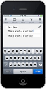
Text Field

TIP: There are two ways to get rid of the keyboard, but they differ on the iPhone and iPad. On the iPad, there is a button near the bottom left of the keyboard that will dismiss it. This button does not appear on iPhone keyboards. In techBASIC on the iPhone, tapping outside of the text field will dismiss the keyboard. On both platforms, pressing the Done key will also dismiss the keyboard.

Text fields are used to enter a single line of text information. They are generally accompanied by a label that describes what to enter.
Place the following code in your program, right before the call to setColor. The new code is shown in bold.
! Create a quit button.
DIM quit AS Button
quit = Graphics.newButton(Graphics.width - 20 - 72, Graphics.height - 37 - 20)
quit.setTitle("Quit")
! Create a text field.
DIM myTextField AS TextField
x = 128
width = (Graphics.width - x - 28)/2
myTextField = Graphics.newTextField(x, 20, width)
myTextField.setBackgroundColor(1, 1, 1)
! Paint the background gray.
Graphics.setColor(0.95, 0.95, 0.95)
Graphics.fillRect(0, 0, Graphics.width, Graphics.height)
! Show the graphics screen.
System.showGraphics
END
The DIM statement defines the variable we will use for the text field. Next we set up the horizontal position for the text field, leaving room for a 100 pixel wide label that we’ll add in the next section. The reason we set x to 128 for a 100 pixel wide label is that we leave 20 pixels at the edge of the screen, just like we did for the Quit button, and 8 pixels between controls. The general rule for iOS control layout is to leave 20 pixels between groups of controls that are not related, and also between controls and the edge of the screen, and to leave 8 pixels between controls that are related. Since the label will be labeling this text field, we only leave 8 pixels between them.
Next we figure out the width of the text field. We’re going to use half of the remaining screen width, leaving some space for another control we’ll add later. Once again, we leave 8 pixels between the controls and 20 pixels for the right edge, dividing the remaining space in half.
The next line calls newTextField to actually create the text field. We use the x and width values to position and size the new control.
Finally, we set the background color for the control to white. This isn’t usually necessary, but text fields usually have a transparent background, blending into whatever is behind them. We set the background to white so you can see the control.
Run the program, and you will see a text field that you can use to enter text. Next we’ll want to read the text that was entered and do something with it. We will use a label for that task, so let’s learn about labels next.
Labels are used for all sorts of things, and you’ll see more examples as the program develops. This time, we will use two labels, one to label the text field you just created, and another to show the characters typed in the text field.
Make the changes shown in bold to add the two new labels.
! Create a quit button.
DIM quit AS Button
quit = Graphics.newButton(Graphics.width - 20 - 72, Graphics.height - 37 - 20)
quit.setTitle("Quit")
! Create a text field with a label.
DIM myTextField AS TextField, textFieldLabel as Label
textFieldLabel = Graphics.newLabel(20, 20, 100)
textFieldLabel.setText("Text Field:")
textFieldLabel.setAlignment(3)
x = 128
width = (Graphics.width - x - 28)/2
myTextField = Graphics.newTextField(x, 20, width)
myTextField.setBackgroundColor(1, 1, 1)
! Create a label to show the current value of the text field.
DIM textFieldValueLabel AS Label
textFieldValueLabel = Graphics.newLabel(x + width + 8, 20, width)
! Paint the background gray.
Graphics.setColor(0.95, 0.95, 0.95)
Graphics.fillRect(0, 0, Graphics.width, Graphics.height)
! Show the graphics screen.
System.showGraphics
END
Most of the new code should be starting to look familiar, even if a couple of new calls were used. Creating and positioning the labels follows the same pattern you’ve seen for creating and positioning buttons and text fields. It works the same way for every other control you’ll see, too.
The setText call is almost always used for a label, setting the text the label will display. The setAlignment call is pretty common. Like all controls, text in a label defaults to left justified. It looks nicer when creating groups of controls to right-justify the text so it all lines up nicely, and left justify the controls the labels are labeling.
With all of the controls in place, the next step is to detect when the user enters new text and respond to it somehow. There are actually two ways to detect changes to text in a text field. One is to wait until the user presses the return key and watch for a value-changed event. You will see lots of examples of value-changed events in the code that follows. For this program, though, we’re going to use a different event. The text-changed event is generated each time the text in the control changes in any way, typically when a new letter is typed. We’re going to pick up text-changed events and copy the text from the text field to the new label to the right of the text field. TO do this, add this subroutine to the end of your program.
SUB textChanged (ctrl AS Control, time AS DOUBLE)
IF ctrl = myTextField THEN
textFieldValueLabel.setText(myTextField.getText)
END IF
END SUB
The subroutine first checks to make sure the control that generated the text-changed event was myTextField. This isn’t important yet, since it is the only control that can generate a text-changed event, but we’ll be adding another control that generates text-changed events later. Once we know we are dealing with the myTextField control, we set the text in the label to whatever is in the text field. When you try the program, you should see everything you type show up in both the text field and label.
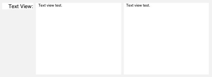
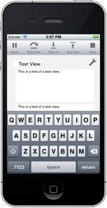
Label
Text views look and work a lot like text fields. The big difference is the amount of text they are designed to handle. Text fields show a single line of text, usually to let the user enter a text response, while text views generally show many lines of text. Because of those similarities, the code to add a text view, along with a label to label it and a second text view to echo the text as it is typed, should look pretty familiar. Add this code to you program to create these three controls, placing it right after the code to create the label for the text field and just before the code to paint the screen gray.
TIP: If you are following along on an iPhone, this is the place to start making changes. Instead of adding this code to the existing program, start by deleting the code that created the text field and its labels, then adjust this code so the fields show up with y set to 20. Use the same idea with the other controls. You can find complete iPhone programs with appropriate adjustments in the download at the end of the article.
! Create a text view with a label.
DIM myTextView AS TextView, textViewLabel AS Label
y = 71
textViewLabel = Graphics.newLabel(20, y, 100)
textViewLabel.setText("Text View:")
textViewLabel.setAlignment(3)
myTextView = Graphics.newTextView(x, y, width, 230)
! Create a read-only text view to show the types text.
DIM textViewValue AS TextView
textViewValue = Graphics.newTextView(x + width + 8, y, width, 230)
textViewValue.setEditable(0)
The last line is the only one that presents a new idea. By setting the editable flag to 0, we are telling the program not to allow the user to type in the right text view.
There are two numbers that may seem a bit magic. The first is using 71 for the location of the top of the controls. This actually comes from leaving 20 pixels above the controls for the text field, 20 more pixels between those controls and the ones we are creating now, and 31 pixels for the height of the text field. How did we know to leave 31 pixels? The documentation tells us the default height for controls.
The other mysterious number is 230 for the height of the text view controls. This one really is a bit magic. The height comes from knowing all of the other controls that we will add later. Until they are added, it’s pretty tough to predict what this number really should be. Don’t be surprised if locations and sizes change a bit as your programs are written.
The last change is to the textChanged event handler. We need to add a couple of lines, shown here in bold, to grab text as it is typed in the left text field and echo it to the right text field.
SUB textChanged (ctrl AS Control, time AS DOUBLE)
IF ctrl = myTextField THEN
textFieldValueLabel.setText(myTextField.getText)
ELSE IF ctrl = myTextView THEN
textViewValue.setText(myTextView.getText)
END IF
END SUB
With these changes in place, you should see three new controls. You should be able to tap the left text view to bring up a keyboard, and any text you type should appear immediately in the right text view.
Text View
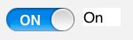
Switches are used to let the user select between an on or off state. Add the code shown in bold to your program to create a switch below the text view, along with a label we will use to show the switch setting. Place the code right after the code that created the text view and its labels.
! Create a Switch control and a label to show its value.
DIM mySwitch AS Switch
y = y + 250
mySwitch = Graphics.newSwitch(20, y)
DIM onOrOff AS Label
onOrOff = Graphics.newLabel(107, y)
onOrOff.setText("Off")
Like many controls, a switch generates a value-changed event when the user changes the value of the switch by tapping it. Add this subroutine to the end of your program to detect the value-changed event and set the onOrOff label appropriately.
SUB valueChanged (ctrl AS Control, time AS DOUBLE)
IF ctrl = mySwitch THEN
IF mySwitch.isOn THEN
onOrOff.setText("On")
ELSE
onOrOff.setText("Off")
END IF
END SUB
We will add lots of other controls that generate value-changed events later, and in fact, the text field already generates them when you press the Done key, so the IF statement to make sure we are dealing with the correct control is pretty important.
Run the program and try out the switch. Make sure the label updates as you would expect.
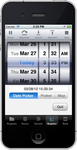
Pickers are used when you need to pick from more than just two possibilities. A picker presents the familiar spinning wheels that let you choose a value from each wheel. Date pickers are pretty common, but they are a special case—we’ll look at them in a moment.
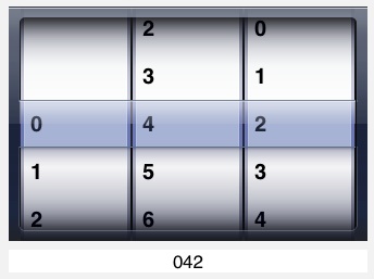
To try out pickers, we’ll create a picker with three wheels, each with the digits 0 through 9. Add this code right before the Graphics.setColor call at the end of your program.
! Create a number picker.
DIM numberPicker AS Picker, wheels(3) AS INTEGER, rows(10) AS STRING
x = 169
numberPicker = Graphics.newPicker(x, y)
FOR i = 1 TO 3
wheels(i) = i
NEXT
numberPicker.insertWheels(wheels)
FOR i = 1 TO 10
rows(i) = STR(i - 1)
NEXT
FOR i = 1 TO 3
numberPicker.insertRows(rows, 1, i)
NEXT
numberPicker.setShowsSelection(1)
In addition to setting up the numberPicker variable, the DIM statement sets up two arrays. We will use wheels to create the three wheels on our picker, and rows to create the ten rows that will show up on each of the wheels.
The call to newPicker sets up the picker itself.
The FOR loop and call to insertWheels creates three wheels on the picker. Change the size of the wheels array and the 3 on the FOR loop to create a picker with a different number of wheels.
The next FOR loop places the digits 0 to 9 in the rows array. We then use the same rows array three times to populate the wheels. While this works fine for our example, there is no reason you have to use the same values in each wheel. The wheels can even have different numbers of values. Any string array will work. The call to insertRows looks at the size of the array to decide how many rows to put on the wheel. The second parameter says to insert the new rows starting with the first position on the wheel. Unless you are adding rows to an existing wheel, this value should always be 1. The last parameter specifies the wheel, counting from 1.
The call to setShowsSelection puts a mask across the center of the wheel that makes it a bit more obvious what rows are selected on each wheel.
Running the program, you now have a picker with three wheels. You can select any number you like. The next step is to add a label to show which value is actually selected. Place this code right after the code to create the picker.
! Create a label to show the results from the number picker.
DIM resultsLabel AS Label
resultsLabel = Graphics.newLabel(x, y + 224, 330)
resultsLabel.setAlignment(2)
This should look familiar, since we’ve used labels to show the value of a control several times. The third parameter on the newLabel call is new, though. As with all controls, the width and height parameters (parameters 3 and 4) are optional. Looking at the documentation for the newLabel call, we see that the default for the Label width is 42 pixels. Setting it to 330 makes the width of the label match the width of the picker, which defaults to 330 pixels wide. Setting the alignment to 2 centers the text under the picker.
Now we need to add a check to the valueChanged subroutine to set the label when the picker’s value changes. The new valueChanged subroutine looks like this, with the new code shown in bold.
SUB valueChanged (ctrl AS Control, time AS DOUBLE)
IF ctrl = mySwitch THEN
IF mySwitch.isOn THEN
onOrOff.setText("On")
ELSE
onOrOff.setText("Off")
END IF
ELSE IF ctrl = numberPicker THEN
r$ = STR(numberPicker.selection - 1)
r$ = r$ & STR(numberPicker.selection(2) - 1)
r$ = r$ & STR(numberPicker.selection(3) - 1)
resultsLabel.setText(r$)
END IF
END SUB
When the value for the picker changes, the code builds a string representing the new value by querying the picker to see which rows are selected on each wheel. The first call to selection doesn’t use a parameter, since the default is 1. It would work just fine if you typed the parameter explicitly, though.
With this change in place, the label shows the current value of the picker each time the picker’s value changes.
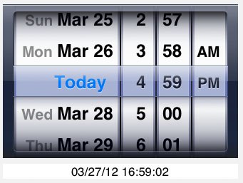
One of the most common uses for a picker is to pick a date. Rather than forcing you to create a picker from scratch each time a date is needed, there is a special kind of picker just to pick dates. To see the DatePicker in action, insert the following code right after the code that created the results label.
! Hide the number picker.
numberPicker.setHidden(1)
! Create a date picker.
DIM myDatePicker AS DatePicker
myDatePicker = Graphics.newDatePicker(x, y)
We’re going to put the date picker right on top of the number picker from the last section, so the first step is to hide the number picker. In the next section, we’ll use a new control to switch between them. The next two lines create the new DatePicker.
Add these lines in the valueChanged subroutine.
ELSE IF ctrl = myDatePicker THEN
DIM datePickerDate AS Date
datePickerDate = myDatePicker.date
resultsLabel.setText(datePickerDate.longDate & " " & datePickerDate.longTime)
When the date picker changes, this code stuffs the new date into a Date object, then uses the Date.longDate and Date.longTime methods to convert the date and time into strings. The result is shown in the results label.
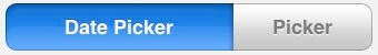
At this point, we have two pickers that occupy the same screen space, and need a way to switch between them. We could use a Switch control, but On and Off are inadequate labels for choosing between two pickers, and we’re going to eventually add another control in the same space. The ideal control to let us pick between these two controls is the segmented control.
A segmented control looks like a row of buttons. The cool thing about a segmented control for our purpose is that exactly one of the buttons is selected at any one time. If the user taps a button, that button is selected, but the originally selected button is automatically deselected at the same time.
Add this code after the code to create the date picker.
! Create a segmented control to choose between various controls.
DIM controlPicker AS SegmentedControl
controlPicker = Graphics.newSegmentedControl(x, y + 253, 330)
controlPicker.insertSegment("Date Picker", 1, 0)
controlPicker.insertSegment("Picker", 2, 0)
controlPicker.setSelected(1)
controlPicker.setApportionByContent(1)
As with the results label, this code is creating a control that is the same width as the pickers. We then add two buttons, called segments, to the segmented control, one for the date picker and one for the number picker. The second parameter to insertSegment specifies the position for the new segment, while the last parameter indicates that we don’t want to animate the change. In general, changes to controls while you are setting them up should not be animated, while changes to controls once the user sees them should be animated. Animation is the default, so we need to tell insertSegment not to animate the transition.
setSelected selects the first segment, so the user sees the Date Picker button selected when the program starts.
The final line tells the segmented control to use varying sizes for the segments, using wider segments for longer strings. It’s not all that important, yet, but after we add another segment, Date Picker will be too wide for the allotted space unless the segments are apportioned.
Add this code to valueChanged to handle taps on the segmented control, hiding and showing the pickers as the segments are tapped.
ELSE IF ctrl = controlPicker THEN
SELECT CASE controlPicker.selected
CASE 1:
numberPicker.setHidden(1)
myDatePicker.setHidden(0)
CASE 2:
numberPicker.setHidden(0)
myDatePicker.setHidden(1)
END SELECT
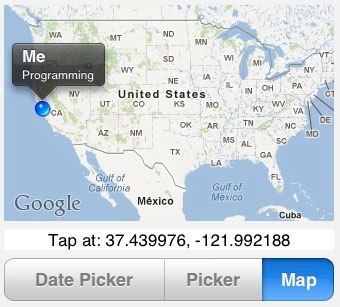
Map views let you bring up an interactive map as part of your program. Let’s add one to our program to see how they work. Add the code shown in bold to your program.
! Create a segmented control to choose between various controls.
DIM controlPicker AS SegmentedControl
controlPicker = Graphics.newSegmentedControl(x, y + 253, 330)
controlPicker.insertSegment("Date Picker", 1, 0)
controlPicker.insertSegment("Picker", 2, 0)
controlPicker.insertSegment("Map", 3, 0)
controlPicker.setSelected(1)
controlPicker.setApportionByContent(1)
! Create a map view.
DIM map AS MapView
map = Graphics.newMapView(x, y, 330, 216)
map.setShowLocation(1)
map.setLocationTitle("Me", "Programming")
map.setHidden(1)
The new insertSegment call adds a segment to our segmented control, allowing the user to pick between the number picker, date picker or map view. That explains why the new map view is added right on top of the pickers, and why it is immediately marked as hidden.
The call to setShowLocation tells the map view to show your current location. The setLocationTitle call sets the title and subtitle for the annotation that will appear if you tap on the blue dot indication your location. Be sure and give that a try in a moment.
Before you can run the program, though, you will need to add some code to valueChanged to show the map view when the Map segment is tapped. Add the lines shown in bold to the existing code.
ELSE IF ctrl = controlPicker THEN
SELECT CASE controlPicker.selected
CASE 1:
numberPicker.setHidden(1)
myDatePicker.setHidden(0)
map.setHidden(1)
CASE 2:
numberPicker.setHidden(0)
myDatePicker.setHidden(1)
map.setHidden(1)
CASE 3:
numberPicker.setHidden(1)
myDatePicker.setHidden(1)
map.setHidden(0)
END SELECT
The map picker does generate a value-changed event, posting the event whenever the size of the map changes. This happens when the map is first drawn and when the user uses a pinch gesture to resize the map. We’ll ignore this event in our program. The map view also generates a new kind of event, the map location event, whenever the user taps on the map. Add this subroutine to the end of your program to pick up the map location event, displaying the latitude and longitude of the tap.
SUB mapLocation (ctrl AS Control, time AS DOUBLE, latitude AS DOUBLE, longitude AS DOUBLE)
s$ = "Tap at: "
s$ = s$ & STR(CSNG(latitude))
s$ = s$ & ", " & STR(CSNG(longitude))
resultsLabel.setText(s$)
END SUB
Most of this is pretty straightforward, but there is one subtlety. The latitude and longitude are returned as double values, which give the location to about 100 Angstroms. To put it mildly, that’s a bit more accurate than the iPad can really determine. Converting the values to single-precision floating-point numbers with CSNG is a cheap way to get rid of the unneeded precision, making the string short enough to fit in our label. The resulting value is precise to about 10 meters or better, depending on where you are on the Earth. While that strips off about one more digit of precision than we’d really like, it’s good enough for our purpose.
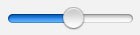
Sliders are used to update values more or less continuously. They include a thumb that the user can drag to set a value. By default, sliders return a value from 0 to 1, although that can be adjusted. Here’s the code to add to create a slider. Add it in the usual place near the end of the program.
! Create a slider.
DIM mySlider AS Slider
y = y + 47
mySlider = Graphics.newSlider(20, y, 129)
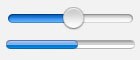
Progress bars are typically used to show progress when it is possible to calculate the percentage of completion as a task is underway, like copying a large set of files on the OS/X operating system. For this example, we’re going to use a progress bar to show the position of the slider created in the last section.
Add this code right under the code to create the slider.
! Create a progress bar to show the slider value.
DIM slideValue AS Progress
y = y + 33
slideValue = Graphics.newProgress(20, y, 129)
Sliders generate value-changed events, so we’ll detect changes in the valueChanged subroutine and set the progress indicator appropriately. Add this code to your valueChanged subroutine.
ELSE IF ctrl = mySlider THEN
slideValue.setValue(mySlider.value)
With these changes, you can slide the slider and see the progress bar track the slider.
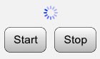
The other way to show that a time-consuming task is underway is an activity indicator, used when performing a task where the progress cannot be accurately determined, like copying large numbers of files on the Windows operating system. Activity indicators can be stopped and started, and are invisible when stopped. This means you can create one and leave it on the screen, starting and stopping it as needed.
To see how this works, we will create an activity indicator and two buttons, one to start it and one to stop it. Add this code after the code that creates the progress bar.
! Create an activity indicator with two buttons to start and stop it.
DIM activityIndicator AS Activity
DIM activityStart as Button, activityStop as Button
y = y + 29
activityIndicator = Graphics.newActivity(75, y)
activityIndicator.setColor(0, 0, 1)
y = y + 30
activityStart = Graphics.newButton(20, y, 60)
activityStart.setTitle("Start")
activityStart.setBackgroundColor(1, 1, 1)
activityStart.setGradientColor(0.7, 0.7, 0.7)
activityStop = Graphics.newButton(90, y, 60)
activityStop.setTitle("Stop")
activityStop.setBackgroundColor(1, 1, 1)
activityStop.setGradientColor(0.7, 0.7, 0.7)
By now, this should be pretty easy to follow. The only statement that might seem a little curious is setting the color of the activity indicator. Why bother? Because the default color for an activity indicator is white, and so is our graphics screen!
The two buttons will start and stop the activity indicator. We need to add code to handle taps on these buttons. Here’s the code, but remember, since we’re handling buttons, the code goes in touchUpInside, not valueChanged.
ELSE IF ctrl = activityStart THEN
activityIndicator.startAnimation
ELSE IF ctrl = activityStop THEN
activityIndicator.stopAnimation
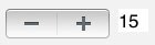
A few controls ago, we looked at how to create a slider, which is used for changing values that the user perceives as continuous. When the value changes by a discrete amount, we use a stepper, instead. Let’s create a stepper that allows a value to range from -50 to 50, changing in increments of five. As usual, we’ll use a label to show the value selected by the stepper.
Add these lines after the code for the activity indicator.
! Create a stepper with a label to show its value.
DIM myStepper AS Stepper, stepValue AS Label
y = y + 57
myStepper = Graphics.newStepper(20, y)
myStepper.setStepValue(5)
myStepper.setMinValue(-50)
myStepper.setMaxValue(50)
myStepper.setValue(0)
stepValue = Graphics.newLabel(122, y, 27)
stepValue.setText("0")
Most of this should be pretty familiar by now. Even the new calls are pretty self-explanatory.
setStepValue changes the amount the stepper’s value changes for each tap.
setMinValue and setMaxValue set the allowed range of values for the stepper.
setValue sets the value for the stepper. Here we’re initializing it to 0.
Add this code to the valueChanged subroutine.
ELSE IF ctrl = myStepper THEN
stepValue.setText(STR(myStepper.value))
This grabs the new value for the stepper and displays it in the stepValue label.
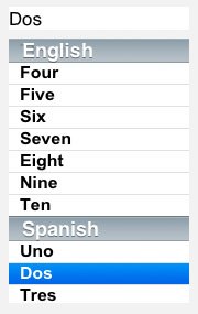
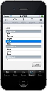
Tables are used to show a list of text items. One example is the list of programs you use in techBASIC. Tables can have sections, and each section can have a distinct header. Here’s the code to create a table in the busy box, along with a label used to display the selected table row.
! Create a table.
DIM myTable AS Table, tableValue AS Label
x = 169 + 20 + 330
y = 321
width = Graphics.width - 20 - x
tableValue = Graphics.newLabel(x, y, width)
myTable = Graphics.newTable(x, y + 29, width)
myTable.insertRow("One", 1)
myTable.insertRow("Two", 2)
myTable.insertRow("Three", 3)
myTable.insertRow("Four", 4)
myTable.insertRow("Five", 5)
myTable.insertRow("Six", 6)
myTable.insertRow("Seven", 7)
myTable.insertRow("Eight", 8)
myTable.insertRow("Nine", 9)
myTable.insertRow("Ten", 10)
DIM sections(2) AS INTEGER
sections(1) = 2
sections(2) = 3
myTable.insertSections(sections)
myTable.insertRow("Uno", 1, 2)
myTable.insertRow("Dos", 2, 2)
myTable.insertRow("Tres", 3, 2)
myTable.insertRow("I", 1, 3)
myTable.insertRow("II", 2, 3)
myTable.insertRow("III", 3, 3)
myTable.insertRow("IV", 4, 3)
myTable.setSectionText("English", 1)
myTable.setSectionText("Spanish", 2)
myTable.setSectionText("Roman", 3)
myTable.setSelection(1)
myTable.setFont("Arial", 16, 1)
This may seem like a lot of code at first, but most of it is just adding rows to the table. The first section sets up the table and label. Other than using a few variables to set the horizontal position and width of the table and label, this should look pretty familiar. The position and width are set to use the rest of the space to the right of the pickers on an iPad display. Since variables are used, it’s easy to move the group around, or reposition them for an iPhone.
The next set of lines sets up ten rows in the table, using the numbers one to ten as the text in the rows.
Our table has three sections, so the next step is to add two more sections using the insertSections method. We’re inserting the new sections right after the initial section, numbered 1, so we use section numbers of 2 and 3 for the new sections.
Finally, we add some rows to each of the new sections. Note that the insertRow call is using a third parameter, the section number, which we did not use when filling in the rows for section 1. The section number defaults to 1, saving some typing for the first section.
The last two lines select a row and set the font.
Tables generate a cell-selected event when the user taps on a row in the table. Add this event handler to the end of the program to detect taps on the table and fill in the label with the selected row.
SUB cellSelected (ctrl AS Control, time AS DOUBLE, row AS INTEGER, section AS INTEGER)
tableValue.setText(myTable.getText(row, section))
END SUB
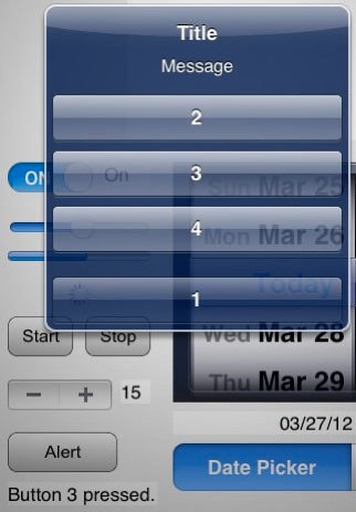
Alerts are not really controls, of course, but they are an integral part of most programs that use controls, so we’re going to take a look at how to create and use them as part of the busy box program. We’ll create a button to show the alert and a label to show the value of the most recently pressed button. The alert itself will have four buttons with simple numbers so we can see how the buttons we create are displayed on the alert.
Start by adding this code after the code that creates the stepper control, and before the code that creates the table.
! Create a button to bring up an alert, and a label to show
! which button was pressed on the alert.
DIM alertButton AS Button, alertLabel AS Label
y = y + 47
alertButton = Graphics.newButton(20, y, 100)
alertButton.setTitle("Alert")
alertButton.setBackgroundColor(1, 1, 1)
alertButton.setGradientColor(0.7, 0.7, 0.7)
alertLabel = Graphics.newLabel(20, y + 45, 135)
You’ve seen all of this before, so we won’t go through it.
The action happens when the button is pressed. Add this code to the touchUpInside subroutine.
ELSE IF ctrl = alertButton THEN
i = Graphics.showAlert("Title", "Message", "1", "2", "3", "4")
alertLabel.setText("Button " & str(i) & " pressed.")
The showAlert call is all it takes to display an alert. The first two strings are required; they display the title and message shown by the alert. All of the next four strings are options. If they appear, there will be a button in the alert at the corresponding position. When the alert is dismissed, showAlert returns the number of the button pressed. If you don’t supply any buttons, showAlert creates one automatically that is labeled OK.
The next line builds a string with the value returned by showAlert and shows it in alertLabel.
Other Controls and Features
There are a few other controls that are specialized enough to deserve a program of their own, rather than learning them inside a busy box setting. These are explored in other articles that will be added later. All are also used in short sample programs you can find in the reference manual. They are listed here in case you want to explore them on your own.
WebView creates a simple but complete browser that can be used in a program to show pretty much any web page.
Image is a class used to load and manipulate images. We can use these to set the image on a button or ImageView, but their real power is loading images from the image library or taking pictures with the camera. Images also allow you to grab the image information pixel-by-pixel for analysis.
Like alert, EMail is not really a control, but it does give you a way to send information from your program to others.
techBASIC can also handle touch and swipe events on the graphics screen. See the reference manual for details.
iPhone Version
Here are screen shots from the five busy boxes, numbered 1 through 5, that implement the controls described in this article.
Source Code
Here’s a download of the source code for the iPad busy box and all five iPhone busy boxes. The download is a ZIP file containing the six .bas files. You can move them to your iPhone or iPad using iTunes. See the reference manual or quick start guide for step-by-step instructions showing how to move programs to and from your computer and iPhone/iPad.

The Completed Program
! Create a quit button.
DIM quit AS Button
quit = Graphics.newButton(Graphics.width - 20 - 72, Graphics.height - 37 - 20)
quit.setTitle("Quit")
quit.setBackgroundColor(1, 1, 1)
quit.setGradientColor(0.7, 0.7, 0.7)
! Create a text field with a label.
DIM myTextField AS TextField, textFieldLabel as Label
textFieldLabel = Graphics.newLabel(20, 20, 100)
textFieldLabel.setText("Text Field:")
textFieldLabel.setAlignment(3)
x = 128
width = (Graphics.width - x - 28)/2
myTextField = Graphics.newTextField(x, 20, width)
myTextField.setBackgroundColor(1, 1, 1)
! Create a label to show the current value of the text field.
DIM textFieldValueLabel AS Label
textFieldValueLabel = Graphics.newLabel(x + width + 8, 20, width)
! Create a text view with a label.
DIM myTextView AS TextView, textViewLabel AS Label
y = 71
textViewLabel = Graphics.newLabel(20, y, 100)
textViewLabel.setText("Text View:")
textViewLabel.setAlignment(3)
myTextView = Graphics.newTextView(x, y, width, 230)
! Create a read-only text view to show the types text.
DIM textViewValue AS TextView
textViewValue = Graphics.newTextView(x + width + 8, y, width, 230)
textViewValue.setEditable(0)
! Create a Switch control and a label to show its value.
DIM mySwitch AS Switch
y = y + 250
mySwitch = Graphics.newSwitch(20, y)
DIM onOrOff AS Label
onOrOff = Graphics.newLabel(107, y)
onOrOff.setText("Off")
! Create a number picker.
DIM numberPicker AS Picker, wheels(3) AS INTEGER, rows(10) AS STRING
x = 169
numberPicker = Graphics.newPicker(x, y)
FOR i = 1 TO 3
wheels(i) = i
NEXT
numberPicker.insertWheels(wheels)
FOR i = 1 TO 10
rows(i) = STR(i - 1)
NEXT
FOR i = 1 TO 3
numberPicker.insertRows(rows, 1, i)
NEXT
numberPicker.setShowsSelection(1)
! Create a label to show the results from the number picker.
DIM resultsLabel AS Label
resultsLabel = Graphics.newLabel(x, y + 224, 330)
resultsLabel.setAlignment(2)
! Hide the number picker.
numberPicker.setHidden(1)
! Create a date picker.
DIM myDatePicker AS DatePicker
myDatePicker = Graphics.newDatePicker(x, y)
! Create a segmented control to choose between various controls.
DIM controlPicker AS SegmentedControl
controlPicker = Graphics.newSegmentedControl(x, y + 253, 330)
controlPicker.insertSegment("Date Picker", 1, 0)
controlPicker.insertSegment("Picker", 2, 0)
controlPicker.insertSegment("Map", 3, 0)
controlPicker.setSelected(1)
controlPicker.setApportionByContent(1)
! Create a map view.
DIM map AS MapView
map = Graphics.newMapView(x, y, 330, 216)
map.setShowLocation(1)
map.setLocationTitle("Me", "Programming")
map.setHidden(1)
! Create a slider.
DIM mySlider AS Slider
y = y + 47
mySlider = Graphics.newSlider(20, y, 129)
! Create a progress bar to show the slider value.
DIM slideValue AS Progress
y = y + 33
slideValue = Graphics.newProgress(20, y, 129)
! Create an activity indicator with two buttons to start and stop it.
DIM activityIndicator AS Activity
DIM activityStart as Button, activityStop as Button
y = y + 29
activityIndicator = Graphics.newActivity(75, y)
activityIndicator.setColor(0, 0, 1)
y = y + 30
activityStart = Graphics.newButton(20, y, 60)
activityStart.setTitle("Start")
activityStart.setBackgroundColor(1, 1, 1)
activityStart.setGradientColor(0.7, 0.7, 0.7)
activityStop = Graphics.newButton(90, y, 60)
activityStop.setTitle("Stop")
activityStop.setBackgroundColor(1, 1, 1)
activityStop.setGradientColor(0.7, 0.7, 0.7)
! Create a stepper with a label to show its value.
DIM myStepper AS Stepper, stepValue AS Label
y = y + 57
myStepper = Graphics.newStepper(20, y)
myStepper.setStepValue(5)
myStepper.setMinValue(-50)
myStepper.setMaxValue(50)
myStepper.setValue(0)
stepValue = Graphics.newLabel(122, y, 27)
stepValue.setText("0")
! Create a button to bring up an alert, and a label to show
! which button was pressed on the alert.
DIM alertButton AS Button, alertLabel AS Label
y = y + 47
alertButton = Graphics.newButton(20, y, 100)
alertButton.setTitle("Alert")
alertButton.setBackgroundColor(1, 1, 1)
alertButton.setGradientColor(0.7, 0.7, 0.7)
alertLabel = Graphics.newLabel(20, y + 45, 135)
! Create a table.
DIM myTable AS Table, tableValue AS Label
x = 169 + 20 + 330
y = 321
width = Graphics.width - 20 - x
tableValue = Graphics.newLabel(x, y, width)
myTable = Graphics.newTable(x, y + 29, width)
myTable.insertRow("One", 1)
myTable.insertRow("Two", 2)
myTable.insertRow("Three", 3)
myTable.insertRow("Four", 4)
myTable.insertRow("Five", 5)
myTable.insertRow("Six", 6)
myTable.insertRow("Seven", 7)
myTable.insertRow("Eight", 8)
myTable.insertRow("Nine", 9)
myTable.insertRow("Ten", 10)
DIM sections(2) AS INTEGER
sections(1) = 2
sections(2) = 3
myTable.insertSections(sections)
myTable.insertRow("Uno", 1, 2)
myTable.insertRow("Dos", 2, 2)
myTable.insertRow("Tres", 3, 2)
myTable.insertRow("I", 1, 3)
myTable.insertRow("II", 2, 3)
myTable.insertRow("III", 3, 3)
myTable.insertRow("IV", 4, 3)
myTable.setSectionText("English", 1)
myTable.setSectionText("Spanish", 2)
myTable.setSectionText("Roman", 3)
myTable.setSelection(1)
myTable.setFont("Arial", 16, 1)
! Paint the background gray.
Graphics.setColor(0.95, 0.95, 0.95)
Graphics.fillRect(0, 0, Graphics.width, Graphics.height)
! Show the graphics screen.
System.showGraphics
END
SUB touchUpInside (ctrl AS Button, time AS DOUBLE)
IF ctrl = quit THEN
STOP
ELSE IF ctrl = activityStart THEN
activityIndicator.startAnimation
ELSE IF ctrl = activityStop THEN
activityIndicator.stopAnimation
ELSE IF ctrl = alertButton THEN
i = Graphics.showAlert("Title", "Message", "1", "2", "3", "4")
alertLabel.setText("Button " & str(i) & " pressed.")
END IF
END SUB
SUB textChanged (ctrl AS Control, time AS DOUBLE)
IF ctrl = myTextField THEN
textFieldValueLabel.setText(myTextField.getText)
ELSE IF ctrl = myTextView THEN
textViewValue.setText(myTextView.getText)
END IF
END SUB
SUB valueChanged (ctrl AS Control, time AS DOUBLE)
IF ctrl = mySwitch THEN
IF mySwitch.isOn THEN
onOrOff.setText("On")
ELSE
onOrOff.setText("Off")
END IF
ELSE IF ctrl = numberPicker THEN
r$ = STR(numberPicker.selection - 1)
r$ = r$ & STR(numberPicker.selection(2) - 1)
r$ = r$ & STR(numberPicker.selection(3) - 1)
resultsLabel.setText(r$)
ELSE IF ctrl = controlPicker THEN
SELECT CASE controlPicker.selected
CASE 1:
numberPicker.setHidden(1)
myDatePicker.setHidden(0)
map.setHidden(1)
CASE 2:
numberPicker.setHidden(0)
myDatePicker.setHidden(1)
map.setHidden(1)
CASE 3:
numberPicker.setHidden(1)
myDatePicker.setHidden(1)
map.setHidden(0)
END SELECT
ELSE IF ctrl = myDatePicker THEN
DIM datePickerDate AS Date
datePickerDate = myDatePicker.date
resultsLabel.setText(datePickerDate.longDate & " " & datePickerDate.longTime)
ELSE IF ctrl = mySlider THEN
slideValue.setValue(mySlider.value)
ELSE IF ctrl = myStepper THEN
stepValue.setText(STR(myStepper.value))
END IF
END SUB
SUB mapLocation (ctrl AS Control, time AS DOUBLE, latitude AS DOUBLE, longitude AS DOUBLE)
s$ = "Tap at: "
s$ = s$ & STR(CSNG(latitude))
s$ = s$ & ", " & STR(CSNG(longitude))
resultsLabel.setText(s$)
END SUB
SUB cellSelected (ctrl AS Control, time AS DOUBLE, row AS INTEGER, section AS INTEGER)
tableValue.setText(myTable.getText(row, section))
END SUB
Copyright 2012, Byte Works, Inc. All Rights Reserved.
Here is the complete program. Take a look at what you’ll learn to do in this blog!